
The best landing page examples share one trait: each page asks the visitor to do one thing, and everything on the page helps them do it. For a local service business, that one thing is usually a phone call, a quote request or a booking.
Below, we look at well-known pages and what they teach. Then we turn those lessons into layouts you can use for a plumber, roofer, med spa or HVAC company in Las Vegas, Henderson, Southern California or Northern Arizona.
TL;DR
- A landing page is a standalone page built for one action. It is not your homepage with a new headline.
- Great examples use a short, benefit-first headline, one clear button, and proof (reviews, logos, awards) near the top.
- Local service pages should name the service and the city on the first screen, with a tap-to-call button.
- Mobile speed and a short form matter more than fancy design.
- Give a new page at least two weeks of data before you change it.
Table of Contents
- What a landing page is, and what it is not
- What the best landing page examples have in common
- Landing page examples worth studying
- How to turn these examples into a local service page
- Copy choices that move people to act
- Common mistakes to avoid
- How to tell if your landing page works
- Our perspective
- Get a landing page built for your market
- FAQ
- Next step
- Sources
What a landing page is, and what it is not
A landing page is a dedicated page with a single goal: persuading visitors to take one specific action. A regular page invites people to browse. A landing page narrows their options.
That is why many landing pages sit apart from the site’s main navigation. Menus give visitors places to wander off to. When you pay for a click from Google Ads, you want that visitor to call, not read your About page.
Here is a quick way to tell the difference:
| Page type | Main job | Typical visitor |
|---|---|---|
| Homepage | Introduce the whole business | Someone who knows your name |
| Service page | Explain one service in depth | Someone comparing options |
| Landing page | Get one action | Someone who just clicked an ad or link |
A service page can also work as a landing page if you strip out the distractions and focus it on one action. Many of our clients start there.
What the best landing page examples have in common
Study enough examples and the same patterns show up. Here are the ones that matter most.
A short headline that promises a benefit
In one review of 30 real landing pages, 26 headlines were seven words or fewer, and the median was five. The subhead did the explaining. Short headlines get read on a phone.
Good: “Same-Day AC Repair in Henderson.” Weak: “Welcome to the premier provider of comprehensive climate solutions.”
One obvious action
The same review found that 18 of the 30 pages had exactly one button in the hero. Pick one next step. “Call now” or “Get my free quote” beats three choices.
Proof near the top
Trust signals such as logos, awards, reviews and testimonials show up again and again in roundups of strong landing pages. For a local business, proof means star ratings, review counts, license numbers and photos of your real team and trucks.
A clean layout
White space and clear hierarchy help people find the next step fast. The same roundup notes that long pages repeat the call to action at the beginning, middle and end.
Fewer exits
Removing sitewide navigation and unrelated content creates a streamlined path toward conversion. Fewer links means fewer reasons to leave.
Landing page examples worth studying
We will describe what each page publicly shows. We are not claiming how well any of them convert. We only point out the choices you can learn from.
Calm: one product, one promise
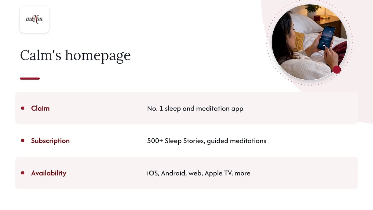
Calm’s homepage leads with a clear claim (the number one app for sleep and meditation) and lists what a subscription includes, such as 500+ Sleep Stories and guided meditations. It also says where the app works: iOS, Android, web, Apple TV and more.
Lesson for you: Say what you do, then list what the customer gets. A roofer can do the same: “Free inspection, written estimate, and 5-year workmanship warranty” (only if you really offer them).
Zola: a feature list that answers questions
Zola names its tools right up front: a free wedding website, registry, guest list, venues and vendors, invites and a budget tool. A visitor knows in seconds whether the site fits.
Lesson for you: Name your services in plain words. A Las Vegas pool company might list weekly cleaning, equipment repair and green-pool recovery in one scannable block.
CD Baby: price and proof in plain sight
CD Baby states its pricing model and its track record: a one-time fee of $9.99 per single or $14.99 per album, no annual fees, and more than $1 billion paid to independent artists since 1998. Clear pricing lowers the fear of hidden costs.
Lesson for you: If you can show a starting price or a free estimate offer, do it. Visitors who see cost early call with fewer doubts.
A “try before you buy” page
One older critique of big-brand pages praised a sample report shown right at the top to build visitor confidence. The same critique noted a benefit-based headline, a directional cue and social proof.
Lesson for you: Offer a small taste. For us, that is a free marketing audit. For an electrician, it could be a free safety checklist or a no-charge estimate.
How to turn these examples into a local service page
Big-brand pages sell apps and subscriptions. You sell jobs in a specific city. The layout changes a little.
One guide for home-service pages says the first screen should do three things: name the service and the location, show a click-to-call button with a visible phone number, and present one obvious next step. An example is “AC Repair in Dallas.” Swap in your own city and you have the model.
Landing page design in Las Vegas, Henderson and beyond
Here is a sample first screen for a made-up Las Vegas plumber. It is an illustration, not a real client.
Headline: Water Heater Repair in Las Vegas
Subhead: Licensed plumbers, same-day visits, upfront quotes.
Button: Call (702) 555-0100 (tap to call)
Proof line: 4.9 stars from 300+ Google reviews
Notice what is missing: no menu, no slider, no stock photo of handshakes. Below it, the page would run through these blocks:
- Three to five bullets on what the visitor gets.
- Real reviews with first names and neighborhoods, such as Summerlin or Green Valley.
- A short form: name, phone, and what is wrong.
- A simple three-step “how it works.”
- Your service area, with cities named.
- A second call button and a final reminder of the offer.
Adjust the local details for your market:
- Las Vegas, Henderson, North Las Vegas: Summer heat drives urgent calls. Lead with “same day” if you can truly deliver it.
- Southern California: Build separate pages for Los Angeles, Orange County and San Diego. Each one needs its own address cues, reviews and photos.
- Flagstaff, Sedona, Prescott: Seasonal and tourism businesses should show the season in the headline, such as winter snow removal or summer tour bookings.
Mobile first, always
Most local searches happen on a phone, so check these on a real device before launch:
- The headline and button fit on the first screen without scrolling.
- The phone number is a tap-to-call link.
- The form has few fields and big, thumb-friendly buttons.
- The page loads fast on cellular data.
Speed is not a minor detail. Google’s research on mobile sites found that each added delay raised the probability of a visitor bouncing, and that faster mobile sites saw gains in conversions. Compress images, skip heavy sliders and avoid pop-ups that cover the button.
If you run several locations, give each one its own page with its own phone number, address and reviews. Copying one page and swapping the city name is a common mistake. Visitors can tell.
Keep the form short
A lead form should sit high on the page and ask only for what you truly need. For most service jobs that means name, phone number and a short description. Every extra field costs you leads.
Copy choices that move people to act
Small wording changes can matter. One copy audit checklist reports several tests, including a switch to first-person button text (“Start my free trial” instead of “Start your free trial”). Treat those numbers as ideas to test, not promises. Results depend on your audience and traffic.
Try these edits on your own page:
- Replace “Submit” with “Get my free quote.”
- Replace “Contact us” with “Call now” or “Book my visit.”
- Put numbers in the headline when they are true: “Quotes in 15 minutes.”
- Write the way your customers talk. Say “AC not cooling,” not “HVAC malfunction.”
A clear call to action also helps people decide. Show the button on the first screen, then repeat it after your benefits and again at the end so ready visitors never have to hunt for it.
Common mistakes to avoid
- Sending ad clicks to the homepage. The visitor has to search for what they wanted.
- Using several buttons with different goals. Pick one.
- Burying the phone number. On mobile, it belongs in the first screen.
- Using fake or vague proof. Use real reviews and real photos only.
- Ignoring page speed. Slow pages lose people before they read a word.
- Not matching the ad. If the ad says “water heater repair,” the page headline should say the same.
That last point links to ad quality. Google says ad quality reflects the experience people have after the click, and landing page experience is one part of Quality Score. Higher quality can mean better ad positions and lower costs. A focused page helps your ads and your leads at once.
How to tell if your landing page works
Pick one number that matters: calls, form fills or booked jobs. Then:
- Launch the page and track every call and form submission.
- Wait at least two weeks before judging. Shopify advises giving a live page at least two weeks of data, and for A/B tests, waiting until you reach statistical significance, typically 1,000 visitors or more.
- Change one thing at a time: the headline, then the button, then the proof.
- Compare leads and booked jobs, not just clicks.
Smaller local campaigns may not reach 1,000 visitors fast. In that case, make one change, wait a few weeks, and watch calls and booked jobs.
If calls are your main goal, find out what missed calls cost you with our free Missed Call Calculator. A great page that sends calls to voicemail still loses jobs. To see how your business shows up in local search before you spend on traffic, run the free Local SEO Checkup.
Our perspective
We build landing pages the way we run every plan: Google-first and conversion-first. A page is judged by the calls, leads and revenue it produces, not by how it looks in a design gallery.
The best examples online are useful for ideas, but most belong to big brands with big budgets. A local service owner needs something different: a fast mobile page, the city and service in the headline, a button that calls, and proof from real customers.
We start from your Search Console, call and conversion data. Then we build one focused page per service or location and track what happens after the click. Pair that page with fast follow-up, and every lead gets an answer, even after hours.
A landing page is one of the quickest wins in digital marketing because it fixes the step right after the click. That is where many small businesses lose the most.
Michael O. Franklin Jr.
Get a landing page built for your market
Our High-Converting Landing Page is a one-off project at $997. It is built for one goal, whether that is calls, quote requests or bookings. You can see the details on our landing page build page.
If you run paid ads, our Google Ads Management is a flat $1,497 per month, plus ad spend. See the Google Ads management plan. Every price we offer is published on our pricing page.
FAQ
What makes a landing page good?
A good landing page has one goal, a short benefit-first headline and one clear button. It shows proof, such as reviews, near the top. It also loads fast on a phone.
How long should a landing page be?
Length depends on how much the visitor needs to decide. A simple phone-call page can be short. A higher-cost service may need more proof and detail. On long pages, repeat the button at the top, middle and end.
Do I need a different landing page for each city?
If you serve several cities or have several locations, yes. Each page should name the city and show local reviews, photos and a local phone number. Pages that only swap the city name give visitors little reason to trust you.
Can I use my homepage as a landing page?
It is better not to. A homepage serves many visitors with many goals. A landing page serves one goal, so the click from your ad or link leads straight to one next step.
How do I know my landing page is working?
Track calls, form fills and booked jobs. Give the page at least two weeks before you make changes. Then test one change at a time.
Next step
Want a second pair of eyes on your page? Request a free marketing audit at mcnmmarketing.com or call (702) 608-4226. We will show you what to fix first.
Sources
- What Is a Landing Page? Build Pages That Convert, Search Engine Land
- What Is a Landing Page? G2
- 30 Best Landing Page Examples in 2026, Ploy
- The 11 Best Landing Page Examples, WordStream
- Calm
- Zola
- CD Baby
- 5 Big Brand Landing Page Examples with Critiques, Unbounce
- Service Landing Page Optimization for Booked Jobs, Service Nation
- Milliseconds Make Millions, Think with Google
- Landing Page Copy Audit Checklist, Arclen
- What Makes a Good Landing Page? Appy Pie
- About ad quality, Google Ads Help
- High Converting Landing Pages, Shopify
Leave a Reply